Friday, 6 December 2013

Thighvertising


This blog generally covers the usual methods of advertising; outdoor, print or television. I’ve also looked at different methods of online advertising but this is something different. Of course, the industry is volatile and often looking for new ways to reach consumers. Thighvertising is a method that definitely doesn’t fit into the normal parameters. A new Japanese trend that aims to capitalise on leering stares and turn a woman’s body into valuable ad space.


Creativeguerillamarketing.com wrote about the trend, in which PR and advertising agencies rent the space on a women’s thigh and apply a transfer tattoo of a brand’s logo or message, encouraging the girls to wear short skirts and high boots so the message appears extra prominent. The accompanying pictures are shocking to a Western audience who may view this act as demeaning, or just plain ridiculous.

Michael Keferl calls the trends validity into question in an article on AdAge. An American expat in Japan, Keferl describes the act as a media stunt performed for the PR company and rarely the company advertised. It seems that in Japan, creative agencies are often struggling to distinguish themselves just like their Western counterparts. As opposed to a trend, he describes this method as merely a handful of teenagers hired by the PR company for one day, to generate news stories both at home and abroad.


Could Thighvertising work? Possibly. Is it demeaning, strange to see something indicative of women being nothing more than a sexualised billboard? Perhaps. I don’t see the trend becoming anything more than a fad story that will be forgotten in the following months. Much like the John St.Prankvertising piece, agencies are coming up with new ways to make their names noticed and compete with big established entities, like DDB or BBDO. Sadly, in none of the articles I found on the trend could I identify the company responsible, a bad PR move by a PR company. 


Thursday, 5 December 2013

New York Lottery "Car, Skier, Tub"


This set of print ads, that will also be used for an outdoor campaign, is another example of a great use of a minimalistic approach. Created by DDB New York for the New York lottery, each ad shows classic examples of lottery winners dreams; a luxury car, a jacuzzi in a beautiful landscape and the having the means to enjoy a skiing holiday. These scenes are juxtaposed with absurd musings on random topics. It is only when the consumer reads the tagline "What would you think about when you wouldn't have to think about money?" that the message is finally communicated.


Creating an ad for a lottery can be remarkably easy, the product you're attempting to sell is entirely desirable and there will always be a demographic who will continue to play each week in attempt to realise their aspirations. However, the tagline appeals to those who may not currently play, offering the viewer a life free from the worries associated with money. Ray Oranges created the artwork for this campaign and I feel the clean lines of his design allows the user to easily imagine what situation they would like to be placed in given they won the prize.


Wednesday, 4 December 2013

Crest "As Nature Intended"


In this print campaign, Crest is attempting to convey their teeth whitening strips as a natural product. The use of the strapline "As nature intended" encourages the belief that Crest strips remove unnatural build ups/colours and return the consumers teeth to their natural state. The campaign consists of three print ads created by New York agency Publicis Kaplan Thaler.


Each ad features some form of human alteration to an environment, a factory billowing out smoke, oil in water and a girl with a tattooed back. Personally, I feel that the campaigns strongest image is of the girl with the tattoos. This ad truly expresses that Crest creates a product that removes stains and it the easiest image in which to identify where the strip has been removed. While the factory scene also communicates the brand message, the image of the oil in water is not as strong. Crest may be better off choosing just the image of the tattooed girl to run this campaign with, as it is the clearest and most resonating of the collection. 


Tuesday, 3 December 2013

Follihair Anchor


Even though I often feature advertisements that are very colourful/busy, there is no denying that my favourite campaigns generally use a lot of negative or white space. This ad, for hair re-growth and maintenance drug Follihair, really stood out to me for its simplicity. No strapline, one image. Great advertising should be able to draw a consumer in and demonstrate the products attributes, which this ad clearly does. With the imagery of the hair follicle connected to an anchor, there is no need for any text. The message has been clearly conveyed.

The campaign was created by McCann Healthcare in Mumbai, India and will run as a print ad in multiple countries. Another positive of not including any text, no translations required! 

Thursday, 28 November 2013

Audible " Romance, Sci Fi and Fantasy"


Quick post to highlight these lovely simple, colourful ads by Taxi for Audible.com. Highlight what the company does without the need for a lot of text. Great pull as well in the free audiobook tagline by the website address.


Wednesday, 27 November 2013

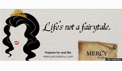
Mercy Academy "Life's not a Fairytale"


Really like this print campaign created for Mercy Academy, a Kentucky based all girls preparatory school, by Doe Anderson. The campaign encourages young women to step away from children's fairy tales and acknowledge the fact that they will have to strike to achieve their dreams, and that they do not need a "prince" to do so. The campaign quickly became viral fodder, and was even covered on the American Today Show.


The copy is jarring, and maybe a little harsh, but undoubtedly refreshing and presenting a clear message to future attendees of the school. It has undoubtedly been a positive move, both on the part of the Mercy Academy and Doe Anderson. 

Tuesday, 26 November 2013

Volkswagen Golf "Under Milkwood"


Looking back on a seminal ad from Volkswagen today. Created for the Gold brand, the campaign, entitled "Night Driving" attempted to recreate the feeling of taking to the road at night and feeling like the only person in the world. Executed with a series of television, print and outdoor advertisements in 2007, the television spot features Richard Burton distinctive voice reading Dylan Thomas' "Under Milkwood". Directed by Noam Burro and produced by DDB London, the ad was followed by a direct marketing campaign 2 months after the campaign began to air.


The ad features a Volkswagen Gold being driven around deserted Los Angele's streets. I think what makes this ad truly remarkable is the soundtrack. The quiet background music does not detract from the poetry, and combined with the imagery, it feels like a massive departure that we see in standard car advertising. It was a very effective campaign to boot, with the Gold achieving its best sales year to date in 2007. 


Thursday, 21 November 2013

Boots "Christmas 2013"


Boots win for weirdest song choice this Christmas, with Bronski Beat's "Smalltown Boy", a song whose lyrics address issues like homophobia and bullying, bringing in the festive cheer. No doubting it's a very catchy song, but seems out of tone with the ad and Christmas in general. Created by Mother London, the campaign depicts a young man sneakily giving friends and acquaintances gifts from Boots in light of their own charitable deeds.


Boots made a major misstep in last year's Christmas advert, with numerous complaint of animal cruelty filed due a shot of a dog being blasted with a hair dryer. Obviously clear to avoid controversy this year, the ad is particularly inoffensive. It's not particularly interesting though either. Youtube views have reached 200,000 in the past week, which is a respectable figure. The spot uses the brand’s “It Feels Good” strapline and highlights the retailer has offers on “1000s of Christmas gifts”. Definitely not my favourite of this year's offerings.

Wednesday, 20 November 2013

John Lewis "The Bear & The Hare"


In direct competition with M&S is John Lewis, a department store that has been lauded for its creative and engaging Christmas ads the past few years. While this piece doesn't feature any celebrity endorsement, it still was a major investment, costing over seven million pounds to create. John Lewis' agency, adam&eveDDB is particularly note worthy in comparing the two rivals campaigns, as adam&eve was founded by ex-staff members of M&S' agency RKCYR/YR, before being purchased  by DDB. The animations in the campaign were provided by a head illustrator from Disney's The Lion King.


The ad documents the story of a hare attempting to show his hibernating bear friend the magic of Christmas, with Lily Allen providing a folksy rendition of Keanes "Somewhere Only We Know" as the soundtrack. It is John Lewis’ most integrated Christmas campaign yet, encompassing an eBook and hardback book, Christmas card maker, social media, in-store and windows, merchandise, digital outdoor projection and soundtrack single.


The campaign has benefitted from a dramatic response on social media. Compared to last year's Christmas ad which has over 3 million Youtube views to date, this year's campaign has amassed 6 million views in the first week of its release. It also boasts near 100,000 Twitter mentions during the same period. Undoubtedly, the brand will consider this venture a complete success. 


Tuesday, 19 November 2013

Marks and Spencer "Believe in Magic and Sparkle"


Some major brands released their Christmas 2013 advertising campaigns in the last week, so it makes sense to start taking a look at them now, however far away the holiday is. Marks and Spencer spared no expense in this television spot, showcasing stars like Rosie Huntington-Whiteley, Helena Bonham Carter and David Gandy. Created by an English agency, RKCY/Y&R, tv spots began airing on the 7th of November. The tagline, "Believe in Magic and Sparkle", is demonstrated throughout the ad with nostalgic nods to children's stories and fairytales.


The advert is beautifully shot and engaging, with a coherent and sweet story line. However, the biggest triumph is the way in which the stores merchandise is displayed. M&S is attempting to reach younger demographics in their clothing offering, and each piece featured in the ad is covetable and on trend. Changing potential consumers perceptions, coming into the Christmas season, will benefit M&S radically.


Thursday, 14 November 2013

Prankvertising: John St "ExFEARiential"

Toronto based ad agency John St. have recently created this spoof of the current prankvertising trend. Advising possible clients they'll do anything to get there brand noticed, from fires, kidnapping or inciting riots. The video has impeccable production values and is a great way for an agency to get their name noticed. I personally think that prankvertising is a bit forced and feel the trend will die down as quickly as it began. Out of everything to come out of it, this spoof video has to be my favourite!


Wednesday, 13 November 2013

Prankvertising: LG "Elevator" and "Stage Fright"

Another of LG's prankvertising videos today. The brand has a real affinity for trying to ramp up sales by scaring people! This video was created by the Amsterdam creative fim, SuperHeroes for the brand in 2012. Again, the video is proof that these types of prank videos create massive internet hype with over 20 million views on this Youtube clip. This prank is a bit more mellow than the last, but still catches out the ad's participants. Remember when viewing that there is a high chance that everyone featured in the ad is a paid actor!


I usually don't feature two advertisements in a blog post, but breaking with the rule today to show the final selection of LG's stint into prankvertising. Created by the same agency as the "Elevator" video, this ad claims to prove how lifelike LG's monitors are by affecting men attempting to use a public urinal with images of beautiful women. The video was uploaded in April of this year and has over 6 million views as of today. 


Tuesday, 12 November 2013

Prankvertising: LG "Meteor"

Prankvertising is a new trend in video advertisements, and there is no doubts to why companies chose to do it. Done successfully, prankvertising often results in viral videos and increased word of mouth. A pertinent example is this video ad by LG created by Grupolink, a Chilean firm. The ad shot into the public domain, with 14 million views and over 600,000 Facebook shares as of today. Commonly known as the most brutal version of prankvertising yet, many doubted the validity of the stunt, assuming participants were paid actors. The ad also was deemed in poor taste by some media outlets, given the current crisis in Syria.


I'm not entirely sold on the concept of prankvertising, but will show a few examples over the next few days and maybe a satirical view or two. 


Thursday, 7 November 2013

IKEA "Kitchen Party"


Looking at the IKEA "Undercover" ad yesterday reminded me of one of my favourite ads from the last few years. "Kitchen Party", created for the UK and Irish markets, was a hugely successful ad, made prominent by the use of Jona Lewie's 1980 hit "You'll Always Find Me in the Kitchen at Parties", covered by Man Like Me. Man Like Me feature as the advertisements protagonists and quickly spiked in popularity as a result, becoming ASOS.com's house band.


The ad was created by Mother London, a London based creative agency. The campaign won a Gold award at the British Arrows in 2011. IKEA also brought out a feature length music video of the ad that is featured below. The ad is humorous, aspirational and creative. IKEA's products are featured heavily and the Youtube video even allows users to click on a product in the video to be directed to the featured product's information. This ad will definitely be one of my favourites for years to come. 

Wednesday, 6 November 2013

IKEA "Undercover"


Gonna bite the bullet and look at one of this year's new Christmas ads, they'll be airing within the next week or two anyway! IKEA ads are usually well done, and this one is no exception. Created by Swedish advertising agency Åkestam Holst, for the Swedish market, this ad demonstrates that even "the busiest man in the world" still makes a trip to IKEA to stock up on Christmas essentials.


The ad is whimsical and invokes the Christmas spirit without being too severe to be seen in November. I'm not someone who is particularly bothered by the festive season starting earlier and earlier each year, but I think this ad might slip past those who are. 


Tuesday, 5 November 2013

Museum of Childhood "Japan, Genius, Balloons"


How beautiful are these print ads, created by AMVBBDO London for the Museum of Childhood? The agency was tasked with encouraging the public to think of the museum as more than a collection of old toys, and instead as a platform to remember the joys of childhood. AMVBBDO commissioned conceptual illustrators who created these colourful images, with the agency inputting ideas and copy.


The museum has gone on to create posters of the campaign, to sell within the gift shop. I've been tracking trying to find a copy of rainy day image, if only to keep as a reminder simple advertising never needs to look boring. As someone who prefers things to look minimalistic and monochromatic, it's a great reminder of how colour can be the most effective tool when imparting a visual message. 


Friday, 1 November 2013

Google Doodles

Slight variation today. I loved the Halloween Google Doodle this year, the stop motion smoke was beautiful! Decided to just select some of my favourite doodles from the year so far. Design wise, it's clear from my selection that I am a fan of white space. 


Thursday, 31 October 2013

Playstation "For the Players"


Today I want to have a quick look at this Playstation ad, created by US agency Drum. Drum created this short film, inspired by the user created twitter hashtag which trending globally in late February of this year. The short film capitalises on Millennial nostalgia, charting the brands growth with that of its primary user base. The ad donates the passing of time with both the growth of the featured characters, the change in cultural references in the setting and the London skyline. The film was covered extensively in blogs and websites, linked in to the major release of PS4 information and hype.


Nostalgia within the target demographic seems to be at an all time high, with references to 80's and 90's culture constantly mentioned on social networking sites. Exploiting their brands important role within this period was a clever move from Playstation, whose advertising is generally of a very calibre to begin with.


Wednesday, 30 October 2013

ECRE "Bloody Stairs"


McCann Erickson's Paris division created a print and television version of this ad for the European Council on Refugees and Exiles. The television ad shows us a familiar picture of a plane with a red carpet placed upon the air-stairs. This image indicates importance and the triumphant music invites the audience to think of arriving celebrities or dignitaries. As the camera pans out, the music falters and we are able to identify the red carpet as a trail of blood. The print ad focuses on this final scene, using the same copy as the television piece.


This ad broaches the important work the ECRE do, encouraging the general public to think about these issues in a heightened way. Changing a person's opinion through advertising is hard, but this ad forces the viewer to acknowledge (and perhaps, alter)  their preconceived opinions on refugees within their own country. It's a great example of an agency taking on Non-profit work and taking a daring step that truly engages with the public. 


Thursday, 24 October 2013

Volkswagen's Area View System "Nap" & "Scout"


Another look at a Brazilian Cannes Lion Print candidate today. The campaign was for  Volkswagen's Area View System, a feature in their new models they wished the public to have a greater knowledge of.  AlmapBBDO was tasked with creating the print ad for the feature.


While the ad is funny and demonstrates why the product has a valuable use, it's focus on children is incredibly savvy marketing. Volkswagen pride themselves on creating family cars, and by highlighting children in both aspects of the print campaign, the real purpose of the product is displayed. Keeping children safe. A well executed ad that deserved to be considered best practice. 

Tuesday, 22 October 2013

Miami Ad School ESPM "RIP"


While looking at the Cannes Lions winners for 2013 I stumbled upon this great print ad for Miami Ad School ESPM, an advertising school based in Sao Paulo, Brazil. The print ads catalogues the overuse of certain historical figures in modern advertising, namely Albert Einstein, Marilyn Monroe and Che Guevara. The print campaign, created by the Brazilian wing of Ogilvy, highlights tired ideas and demonstrates how the school can help eradicate this type of overused creative.


My favourite aspect of the ad is the strong copy featured in each version, encouraging the marketer to "Let Him/Her Rest in Peace". The school's message is clearly communicated with this and despite being cluttered with visuals, is strong enough to remain with the reader.


Sunday, 20 October 2013

Energia


Another look at a campaign by Irish agency Boys and Girls today as part of our small retrospective.  This print campaign for Energia was accompanied by a series of radio ads that focused on Energia being the country's largest electricity supplier to Irish SME's. Energia were faced with an issue, despite having a large business consumer base, they were largely unknown by the general public. Competing against established names like Bord Gáis and ESB, this campaign aimed to put Energia's name into the public conscious and build brand awareness.


The ads juxtaposed two business environments together in a humorous fashion, highlighting the wide range of companies in Energia's client base. These print ads were the beginning of a massive campaign, involving television ads and the sponsorship of Pat Kenny's infamous move to Newstalk FM. 

Wednesday, 16 October 2013

Quick link

Just a quick link to the site Joe la Pompe. Around since 1999, the site finds copycat ads the world over and names/shames. Great reminder that plagiarism is quickly spotted and rarely forgotten!
http://www.joelapompe.net/

Music Faux Passe

Today I read about an advertising music faux passe I had to share. All three of these ads ran concurrently, some even airing in the same timeslot. Choosing a popular song to identify with your brand is all well and good, but it seems like a massive misstep to not view who else is using the exact same song. Major blow for the agencies media buyers also, as running the ad in the same slot as another with the same backing music deeply diminishes the chances of the second product being remembered.

 Realistically, while the song (M83's "Midnight City" if you're interested) is great, it is so deeply ingrained in my head as Made in Chelsea's theme song it is a poor choice for any brand!
 

Tuesday, 15 October 2013

Powers "It's Ours"


Today I'd like to continue a short look at the work of Irish advertising agency Boys and Girls. This outdoor and print advertisement for Power's Whiskey won them a bronze award in the Outdoor category of this year's Kinsale Sharks International Creative Festival. Authenticity and craft were the keywords in this campaign, and intrinsic to Power's brand identity as a whole. The company wished to promote their strong sense Irish heritage and tradition.


In the ad, landscape photos of Ireland are rendered on to images of Power's whiskey in glasses. In the words of the agency themselves; "The Burren was photographed to provide the basis for the Hot Powers execution. Ladies View in Killarney was shot showcasing a changing Irish landscape. A Barley field in Louth captured a key ingredient in the Whiskey and Ballintoy Harbour in Armagh provided a memory of a great weekend." The images are beautiful, and truly reflect the brand image. I think this work is a great example of a simple creative premise executed to perfection, creating an advert that appeals to multiple generations.